Reveal by rendering
Should cyclists wear a pollution mask commuting across today's cities?
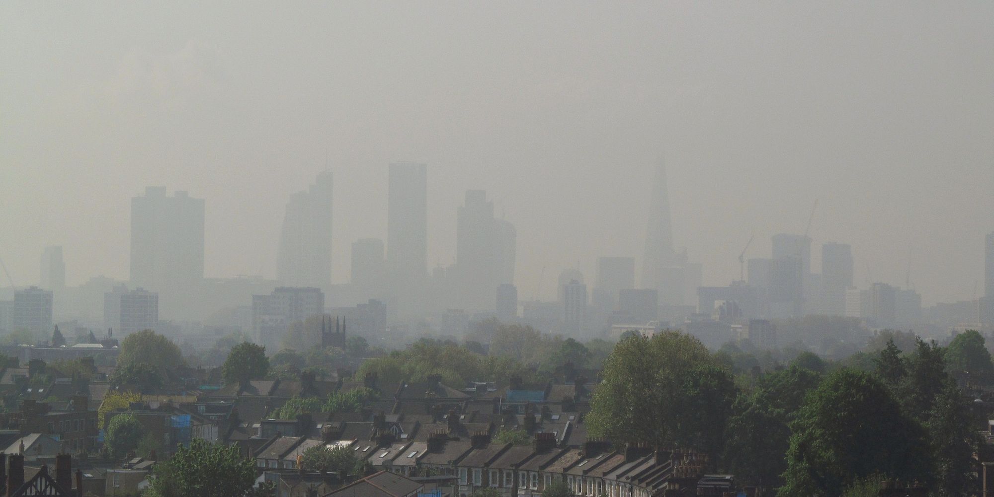
Despite numerous pollution studies and unprecedented access to data – it is still difficult to piece together the available information to determine what impact pollution has on the health of those cycling through cities.
I set out to see the levels of pollution we might be exposed to when cycling to work, by using publicly available pollution data and a bit of data modelling and mapping.
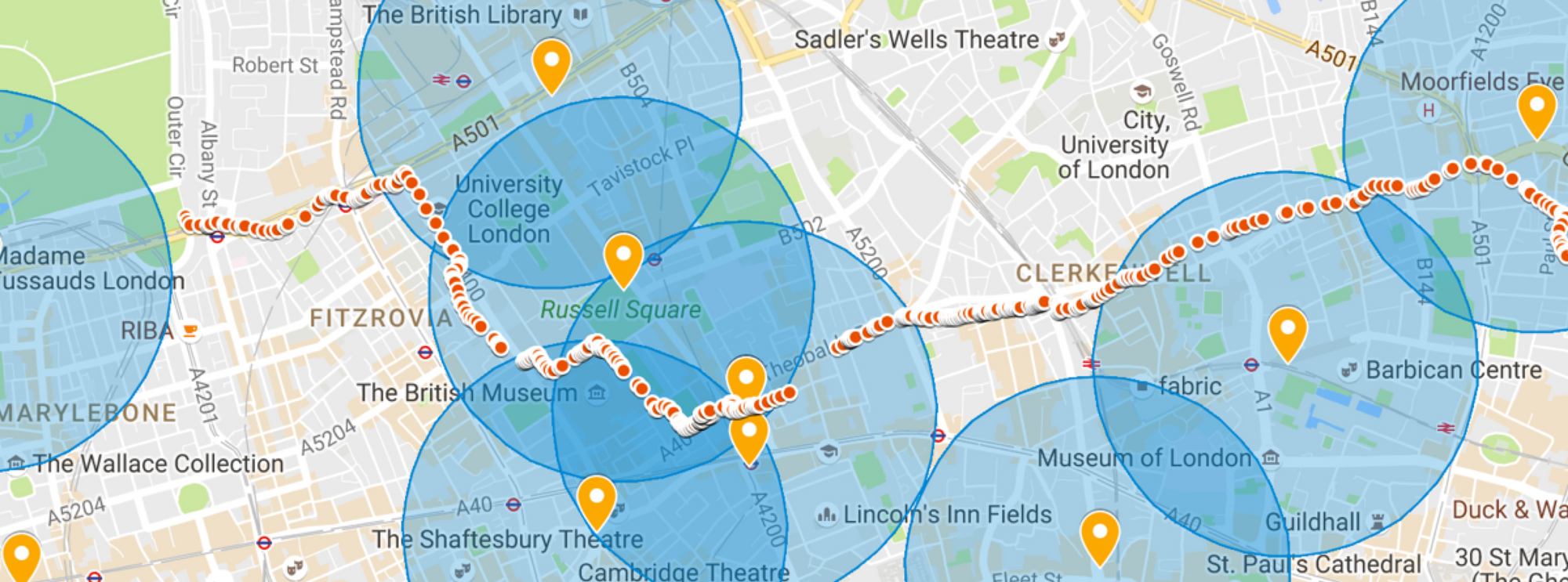
I started by combining route data from my cycling computer with the publicly available data from King's College London and the local authorities of London's air quality monitors dotted around the city. Their data, in the form of API's could be accessed via Londonair.org.uk.
Using Google's Map Builder I was able to quickly visualise how the London Air's data sources were distributed. However, it was immediately apparent that London Air's data set provided limited coverage. It was sparse - with large gaps making it difficult to accurately determine the pollution levels along my cycle commute.
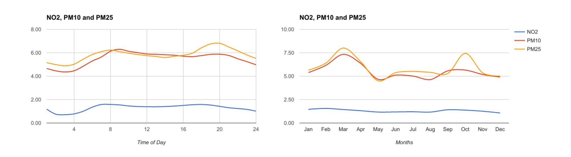
I found a much more detailed data set with far more data points published by the London Data Store. The London Atmospheric Emissions Inventory (LAEI) details emissions for N02, PM10 and PM2.5 levels across the city, the pollutants a commuter can be exposed to (see below).
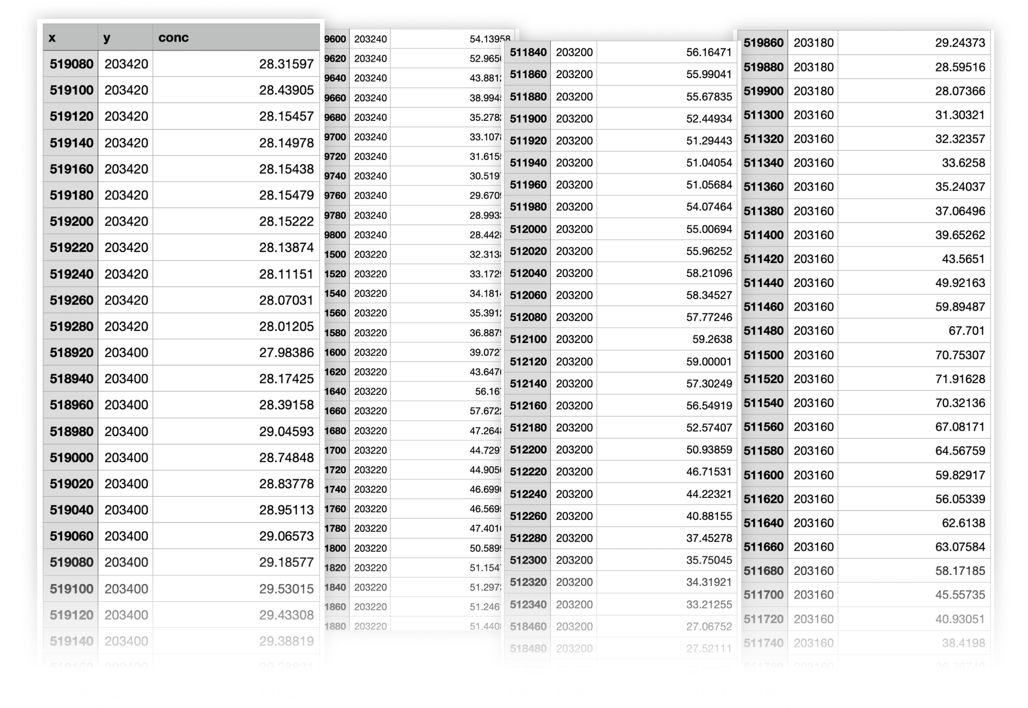
This seemed ideal until I actually plotted it on a map. The resulting render showed the data points organised across a perfectly uniform grid. I don't think they have been able to place physical sensors at perfect 50m intervals. So what's going on?
It turns out, London Data Store uses only a few sensors across London, and then, using a model based on meteorological and traffic data, extrapolates the rest of the data points. You can clearly see the result of this modelling on the map below due to the uniformity of the points.
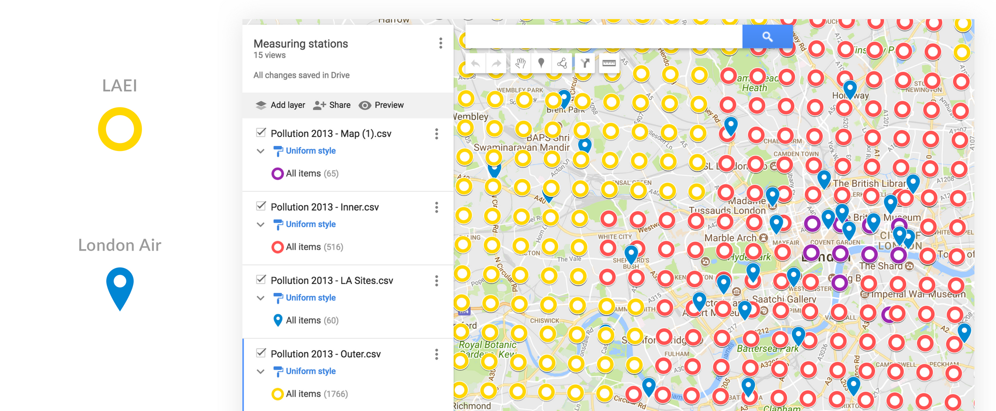
Visually mapping and layering these two different data sets, London Air and the LAEI, revealed the real provenance of this data.
This is something I wouldn't have appreciated had I not taken the data out of its original spreadsheet format and overlaid it onto a map of London.
It was important to understand that the pollutant data for the coordinates in these data sets are extrapolations and not actual levels, but using the World Health Organisation's guidelines for these pollutants, I was still keen to explore how a route's 'Pollution Exposure' could potentially be calculated.
Taking into account seasonal and daily fluctuations, I mapped this pollution exposure for NO2 onto my commute coordinates, creating a visual representation that started to feel useful.
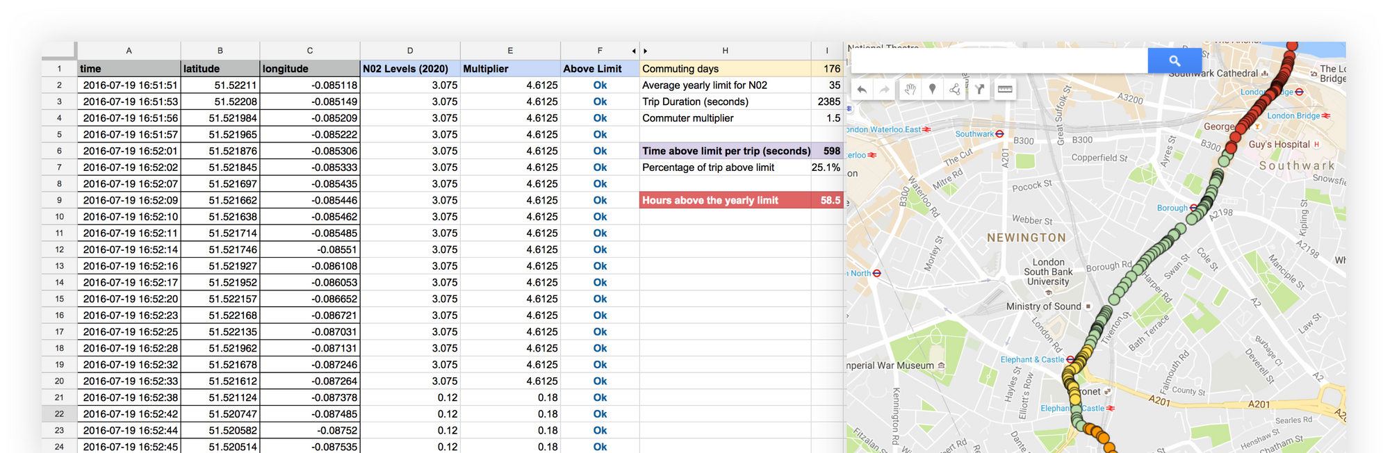
Commuting from south to central London, 176 days a year (about half of it), would mean you could spend 58 hours that year above the WHO limits for N02 pollution.
But what does 58 hours of exposure really mount up too, and how dangerous is the long term effects of that exposure level? Maybe the exercise you get from the ride outweighs the risks of the exposure? Ultimately – the verdict on air safety and whether to wear a mask is still left to us, the individual.
Whilst I can't say that a greater understanding of the data has given me a definitive answer, it has delivered new insights and prompted me to ask more questions. The visual rendering of the data helped me better understand its provenance, proving a powerful tool in examining and interrogating data sets and exposing their true colours.